Coldbrew Union
Can design for a cold brew coffee roaster
- Category
- Packaging
- Year
- 2024
- Services
- Packaging Design · Label System · Typography · Print Production
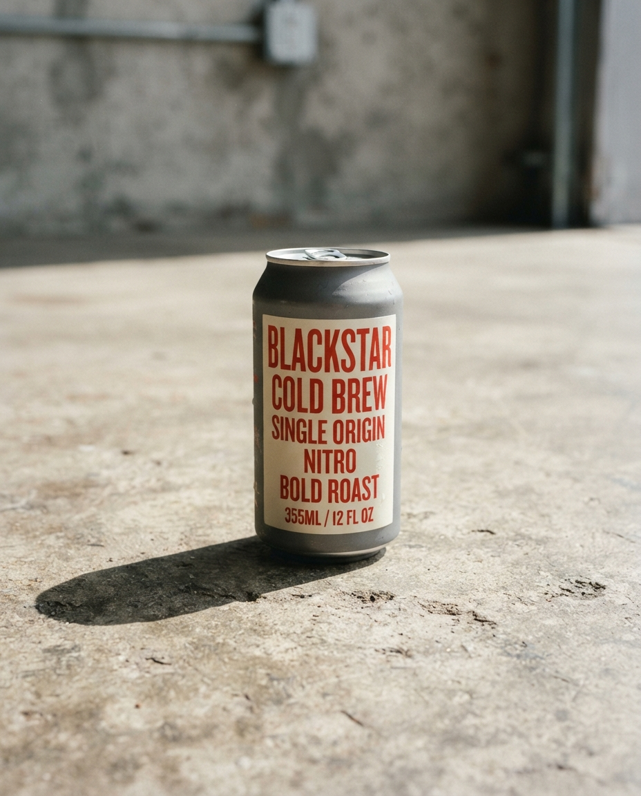
A packaging system for a cold brew roaster scaling from farmers markets to grocery shelves — loud on a crowded fridge door, quiet in your hand.
The brief
Coldbrew Union was roasting out of a shared kitchen and selling at Saturday markets, where their hand-labeled bottles actually worked. But the first grocery buyer they pitched told them the truth: on a fridge door next to forty other cans, hand-cute reads as amateur. They needed packaging that could shout from six feet away and still feel considered up close.
What we did
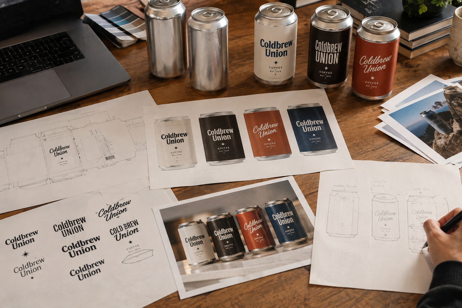
One typeface, one color move. We set the brand in a condensed sans at a size most brands would call reckless — the word UNION wraps almost the full height of the can — and held everything else back: matte aluminum, cream ink, and a vermilion that changes meaning by roast. Light roast gets more cream; dark roast gets more vermilion. The shelf becomes a gradient across the line, which does the variety signposting without a single icon.
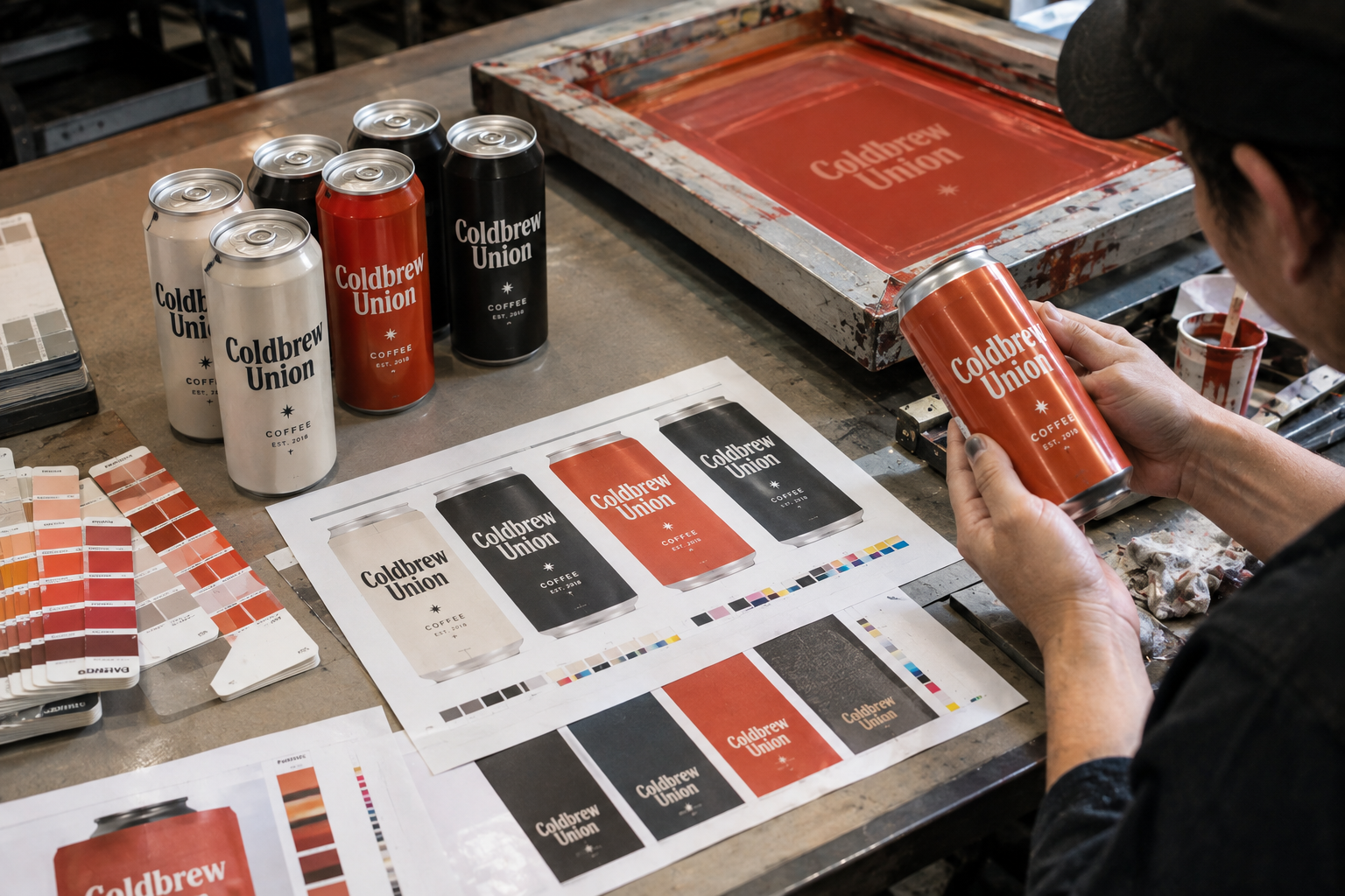
Because ink on aluminum behaves nothing like ink on paper, we proofed every color at the actual printer, on actual stock. Six passes on the vermilion. Worth it.
The outcome
The line shipped into 140 stores in its first quarter. Coldbrew Union’s distributor now leads pitches with the cans themselves — the shelf gradient does more selling than any sell sheet. The founders kept the hand labels for one thing: the market stand, where they started. Both versions can be true.
The Process