Bellwether Type
Identity for an independent type foundry
- Category
- Branding
- Year
- 2024
- Services
- Identity Design · Art Direction · Specimen Design · Web Design
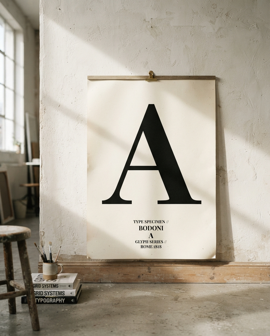
A specimen-led identity for a two-designer type foundry — where the product is typography, so the brand had to be typography too.
The brief
Bellwether Type is a two-person foundry releasing retail typefaces with real craft — and a brand that looked like a placeholder. Their site was a font list, their specimens were autogenerated PDFs, and nothing said these are the people who drew that. When your product is typography, the bar for your own typography is brutal. They knew it, which is why they called.
What we did
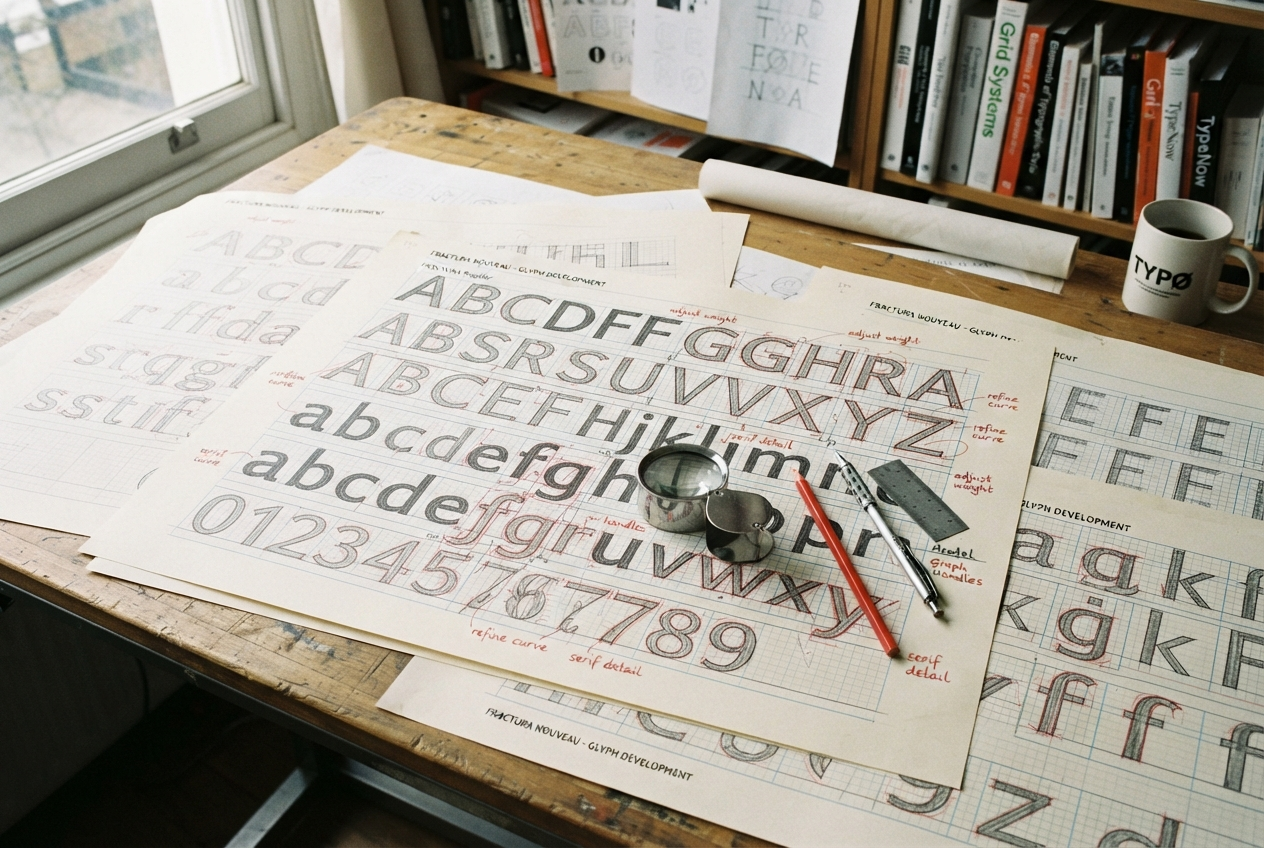
The identity is drawn, not set. We built a bespoke display cut — the same construction grid and terminal logic as their flagship retail serif — so the foundry’s own voice is literally made of its craft. Everything downstream flows from specimens: the website treats each release like an exhibition, with try-it-first pages, optical-size demos, and drawing-process notes published alongside the fonts.
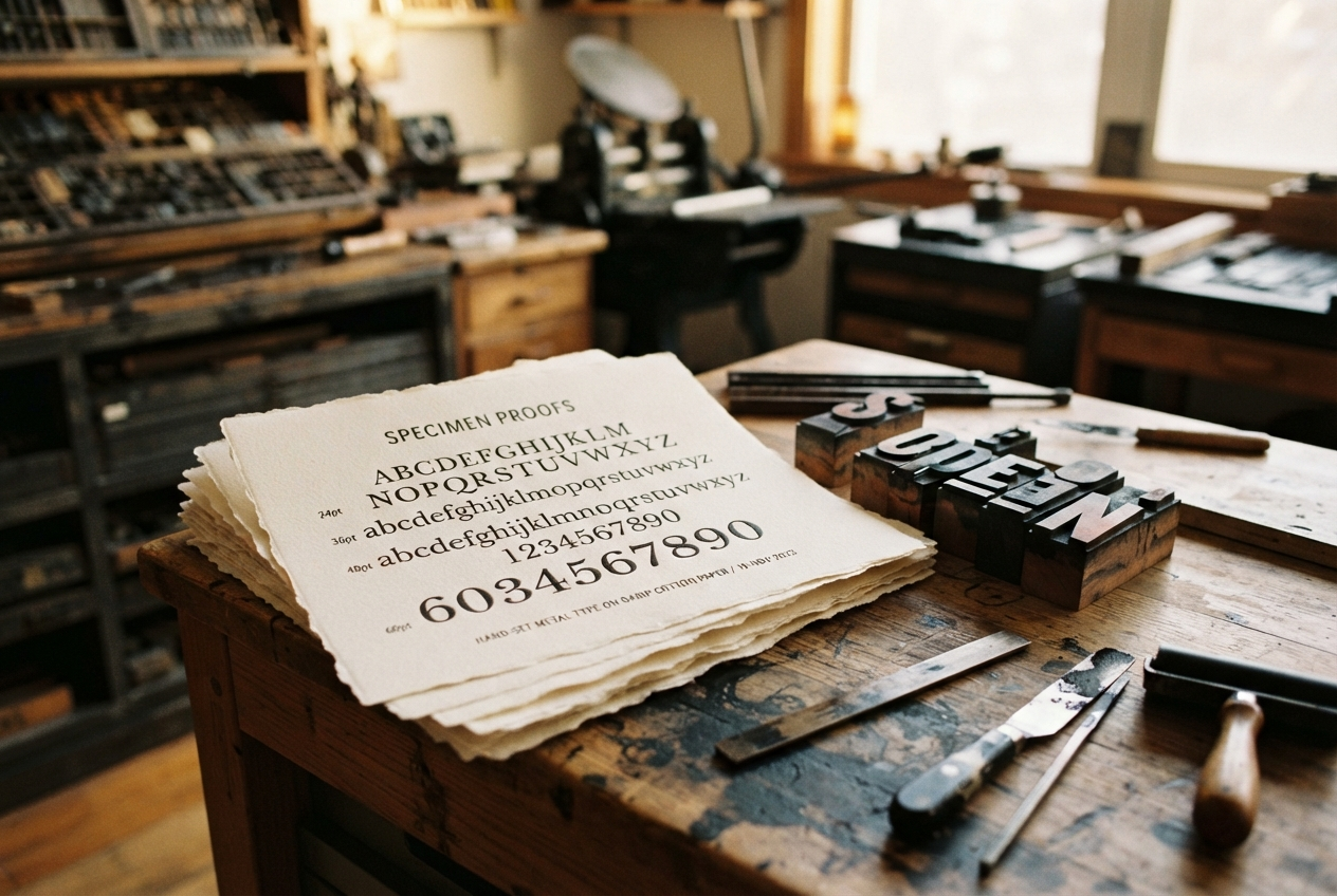
We also designed the print specimens — letterpress, two colors, shipped with every retail license. A physical object that says a human drew these curves beats any EULA for building trust.
The outcome
Bellwether’s licensing revenue grew steadily across the year after launch, with a meaningful share of buyers citing the published process notes as the reason they chose the foundry over larger libraries. The drawn display cut has since been extended into a full internal family — and yes, the joke in the studio is that it will eventually be released as a retail face. The spec sheet is already drafted.
The Process