Marrow & Salt
Identity for a coastal restaurant group
- Category
- Branding
- Year
- 2025
- Services
- Brand Strategy · Identity Design · Menu System · Signage · Print Production
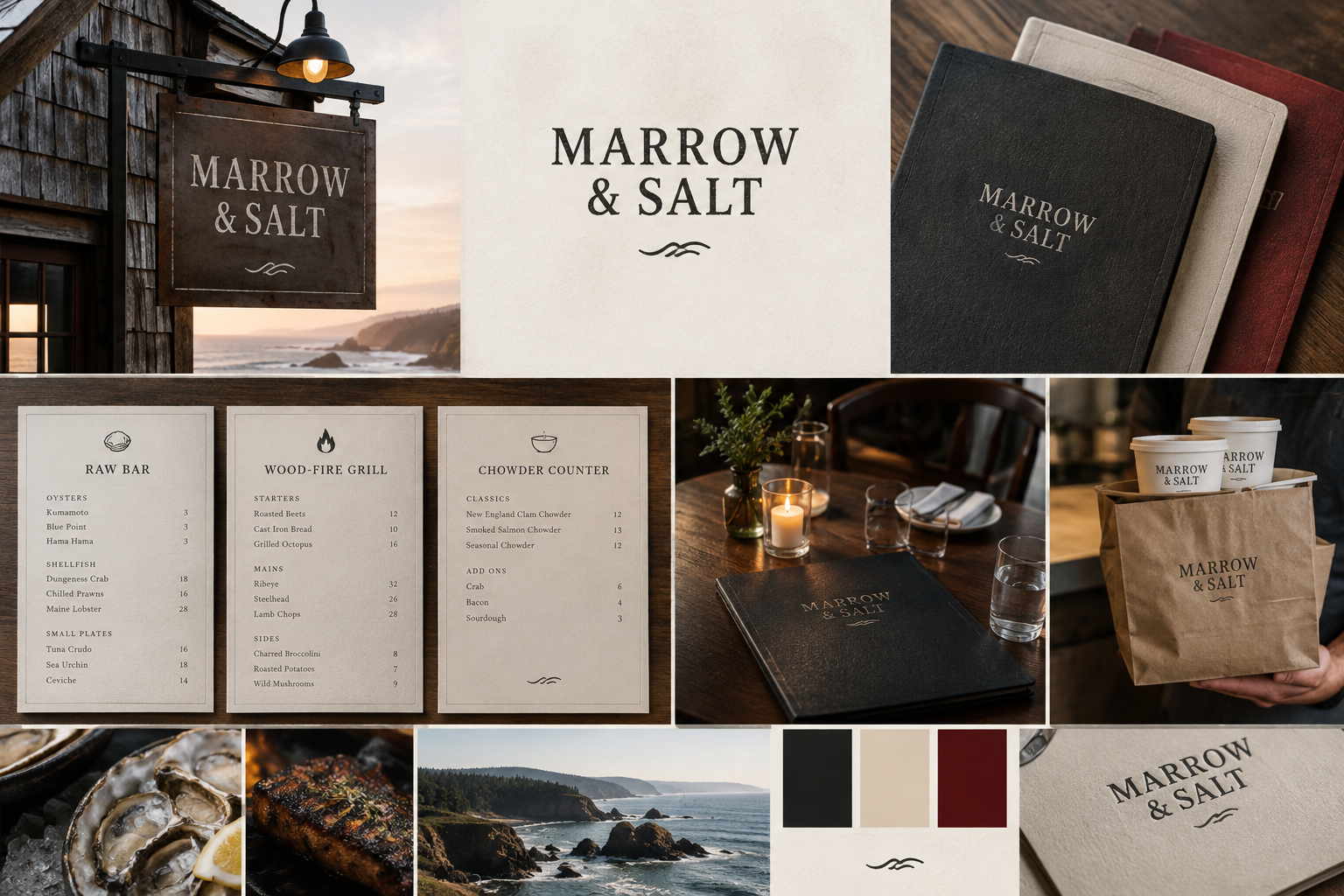
A full identity for a three-venue restaurant group on the Oregon coast — wordmark, menus, signage, and a print system built to survive salt air and candlelight.
The brief
Marrow & Salt runs three venues within four miles of each other: a raw bar, a wood-fire grill, and a takeaway chowder counter. Each had its own logo, its own voice, and its own idea of what the group stood for. The founders wanted one identity flexible enough to live across all three — without flattening what makes each room different.
What we did
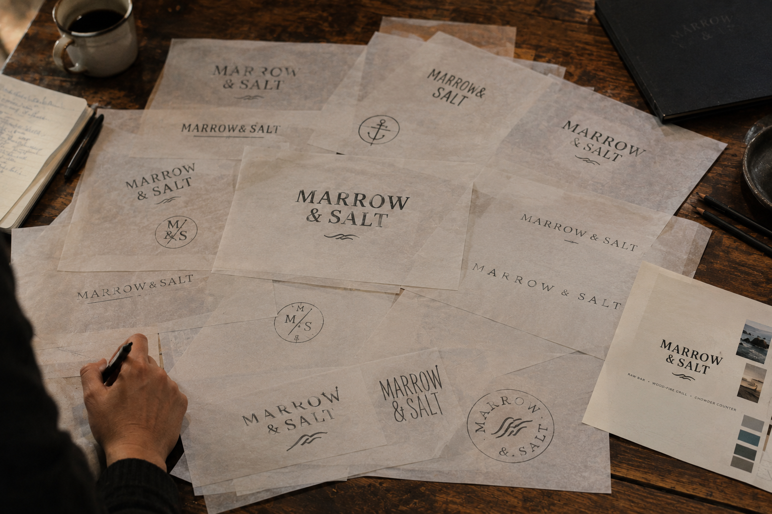
We started where the food starts: the coast. The wordmark is a drawn serif, slightly weathered at the terminals, set tight — it reads like something stamped on a crate at the docks rather than designed in a studio. Around it we built a system: bone and charcoal as the ground, a single oxblood accent reserved for the grill, and a menu architecture that lets each venue swap sections daily without redesigning anything.
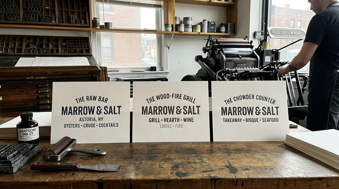
The debossed menu covers are produced by a letterpress shop two towns over. We drew the dielines, sat in on the proofing, and fought for the heavier stock — you can feel the wordmark with your thumb before you open the card.
The outcome
Three venues, one family. Reservations across the group rose through the first season after launch, and the takeaway counter — previously the awkward sibling — now carries the same menu system as the raw bar. The founders stopped describing themselves as three restaurants and started saying Marrow & Salt. That’s the whole job, really.
The Process