Saltmarsh Provisions
Label system for a small-batch coastal pantry brand
- Category
- Packaging
- Year
- 2025
- Services
- Packaging Design · Illustration · Label System · Brand Voice
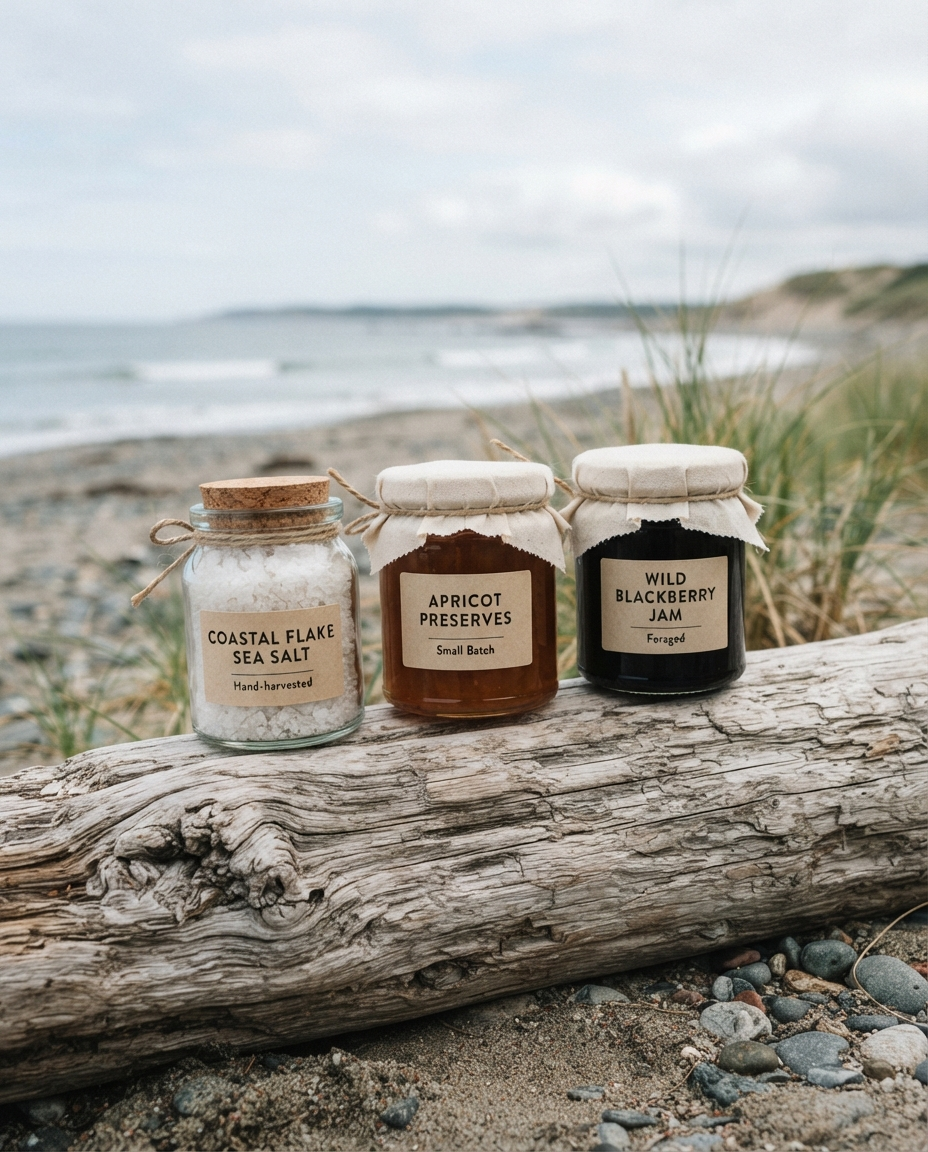
Labels, jars, and a hand-drawn illustration library for a sea salt and preserves maker selling direct from a farmhouse kitchen.
The brief
Saltmarsh is a one-woman pantry: sea salt raked from a nearby estuary, preserves cooked in a farmhouse kitchen, sold at markets and through a tiny web shop. The product was extraordinary and the packaging was generic jars with laser-printed stickers. She wanted labels that felt like the place — the estuary, the hedgerow, the kitchen table — without tipping into rustic cliché.
What we did
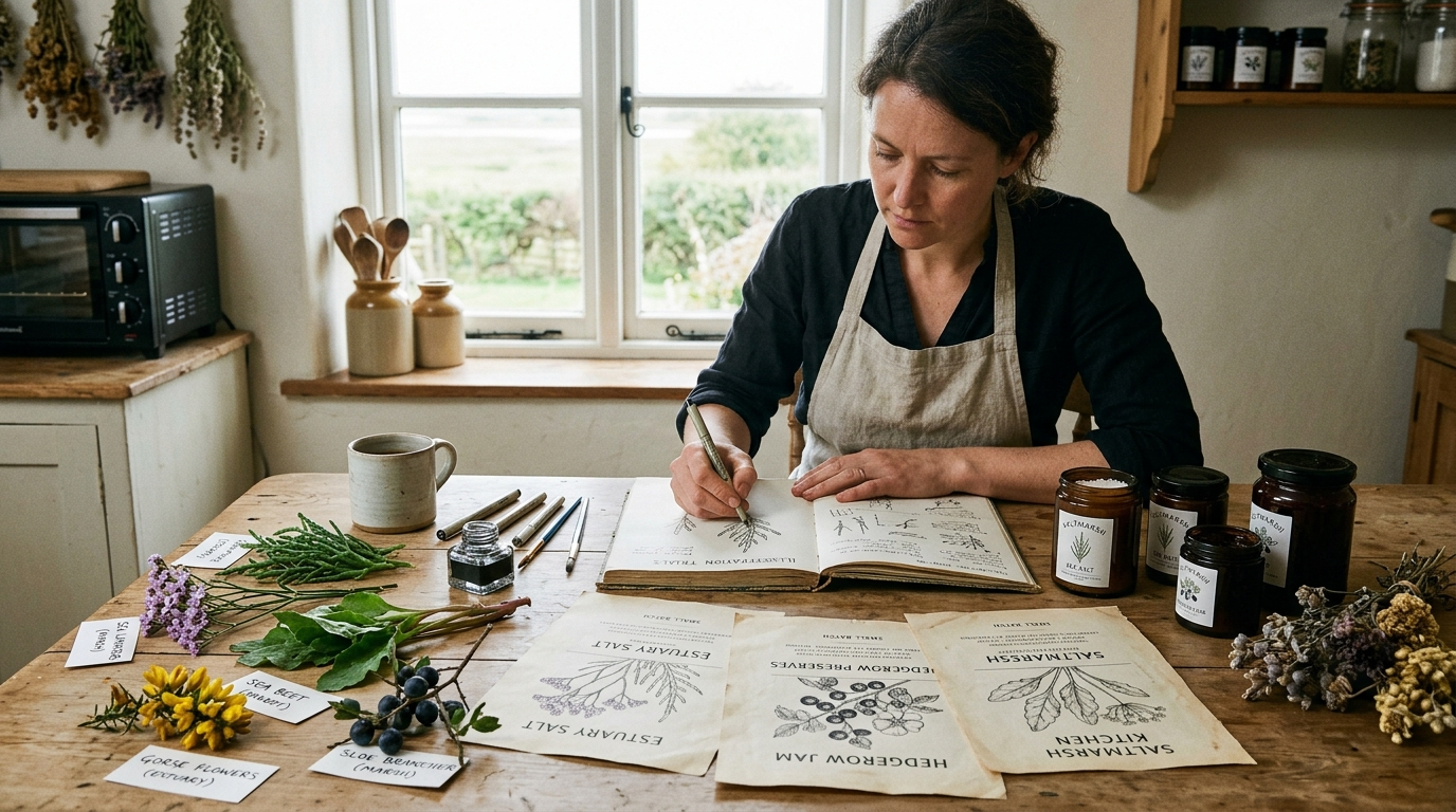
We built a hand-drawn illustration library first: nineteen coastal botanicals, each drawn from specimens gathered within a mile of the kitchen — sea beet, samphire, wild fennel. Every label in the range draws from that library, so the line grows naturally as new products arrive instead of needing redesigns.
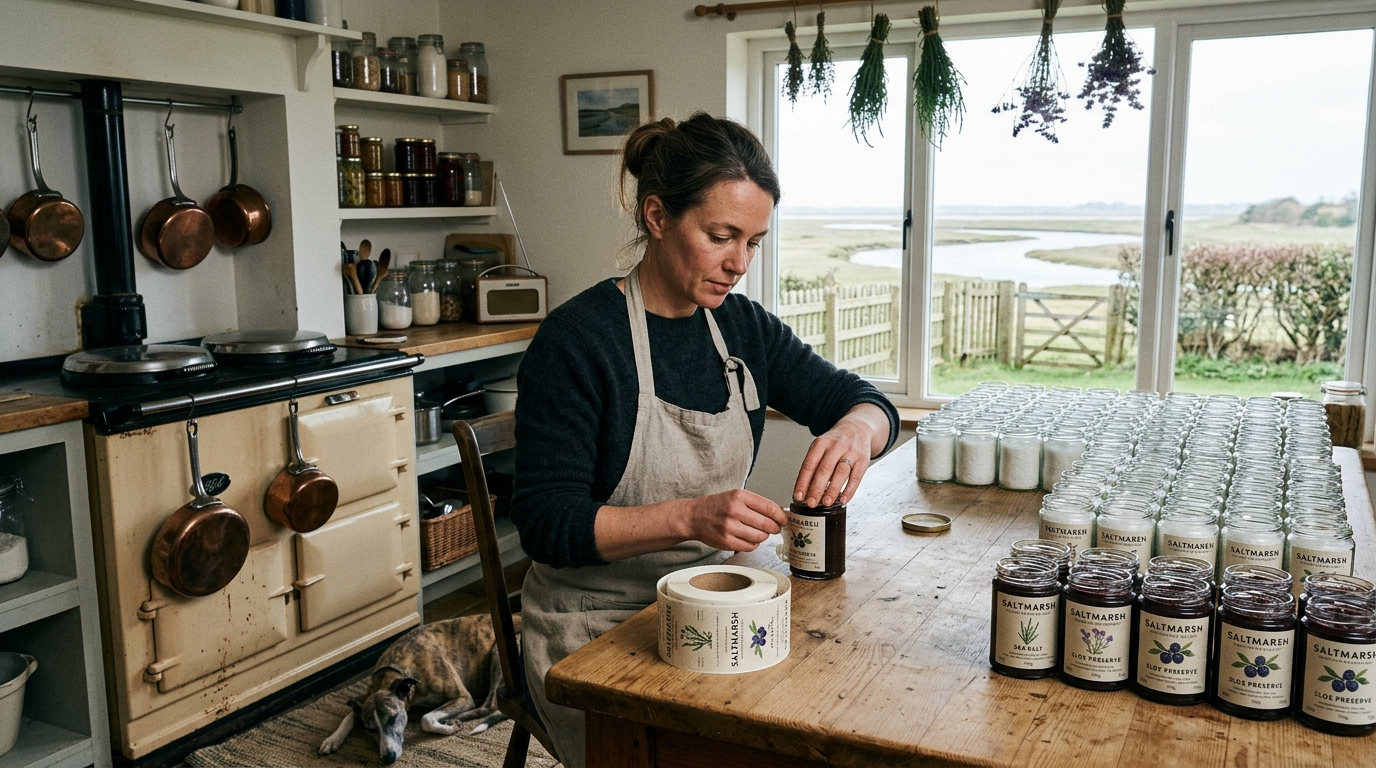
The label itself is calm: cream paper, one ink, the product named plainly, with a short first-person note from the maker on the back. We sized everything for hand application — she labels a few hundred jars a month herself, standing at the kitchen table, and the design respects that.
The outcome
Saltmarsh moved into six farm shops and one very good grocer within the season, with no sales rep and no ad spend — the jars did the talking. Wholesale buyers consistently mention the back-of-jar notes as the reason they called. The illustration library now has twenty-four entries and a waiting list of products to draw.
The Process