Verity Press
Identity and cover system for an independent publisher
- Category
- Branding
- Year
- 2024
- Services
- Brand Strategy · Identity Design · Cover System · Editorial Design

A typographic identity and flexible cover system for a literary press reissuing forgotten mid-century novels.
The brief
Verity Press reissues mid-century novels that fell out of print — often by women writers the canon misplaced. The editor-founder had gorgeous taste and zero system: every cover was a one-off, and ten books in, the list had no shelf presence at all. She needed an identity that made Verity recognizable as a publisher, while leaving each book room to be itself.
What we did
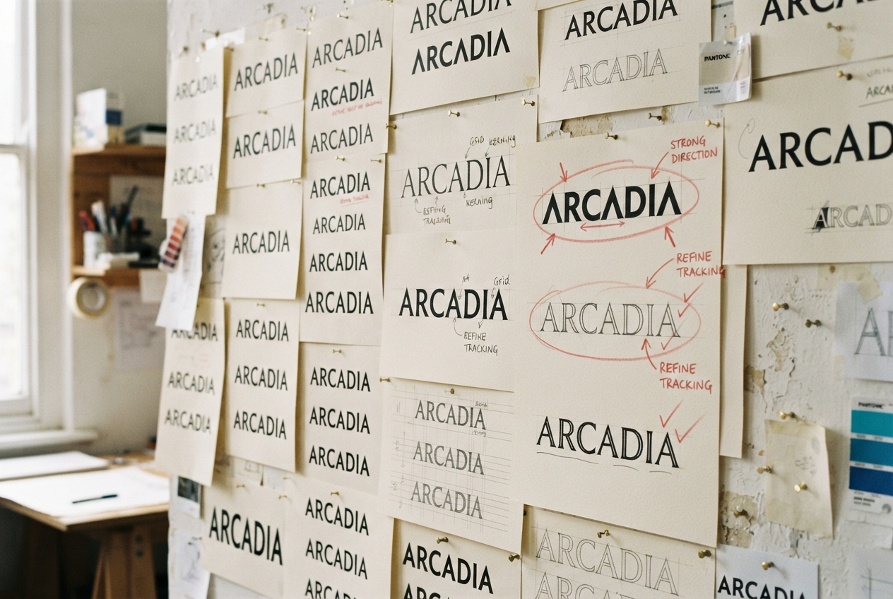
Type only. No pictorial marks, no illustrations on spines — the identity is a drawn serif wordmark, a strict spine formula (title, author, a single rule, the Verity colophon), and a palette of four paper-ground colors that rotate across the list. A buyer can spot a Verity spine from across a shop and still not mistake one title for another.
Inside, every book shares a grid and a type scale, but each gets one expressive move — a dropped initial, a marginal gloss, a chapter opener set full-bleed. The system breathes without breaking.
The outcome
The reissued list now occupies its own bay in two national chains, and booksellers report customers buying Verity titles on the spine alone. The first paperback line launched using the same system with zero new design work — which is the quiet test of whether an identity actually works.
The Process